Redesigning the Registration Journey for e-Learning for Healthcare
Simplifying Access to Healthcare Training for Millions Across the UK
The e-Learning for Healthcare platform, delivered by Health Education England, provides 24/7 access to high-quality, nationally accredited online learning for healthcare professionals across the UK. With a potential user base of up to 3.2 million clinicians, NHS staff, and academics, the platform plays a vital role in supporting clinical education and ongoing development.
We were asked to redesign the online registration process, a crucial gateway to the platform, to make it more accessible, intuitive, and inclusive for users with varying levels of digital confidence.
My Role
As the UX designer on the project, I was responsible for:
Developing proto-personas to reflect different healthcare user groups
Planning and conducting user research and testing
Designing low- and high-fidelity prototypes
Creating a style guide to support consistent visual language and accessibility across the experience
Understanding the Problem
We began with a brainstorming workshop with stakeholders, using real user feedback to identify friction points in the existing registration journey. One of the key challenges was that users needed to validate their identity and provide professional details as part of the onboarding process. A necessary step for compliance, but one that caused confusion and frustration for many users, especially those with lower digital confidence.
To better understand the experience from the user’s perspective, I created proto-personas representing a range of user types across the NHS and academic institutions. These helped us recruit a diverse set of users for interviews, where we explored common pain points and emotional barriers, including unclear steps, inaccessible terminology, and concerns about making mistakes.
Affinity mapping: Organising user feedback from our baseline usability test to identify key pain points and themes in the existing registration journey.
Defining the MVP
From the discovery work, we identified 12 distinct user segments. To deliver meaningful impact within scope, we focused the minimum viable product on the three largest groups:
Clinical NHS workers (e.g. doctors, nurses)
Non-clinical NHS workers (e.g. administrative, support staff)
Academic users (e.g. students and educators)
I simplified and restructured the registration journey to better meet the needs of these groups, streamlining the steps while still collecting the required data for identity and reporting.
Designing Solution
With a clear direction in place, I moved into designing and testing the new experience:
Created low- and high-fidelity designs, following the UK Government Digital Service (GDS) Design Principles
Ran usability testing sessions with current platform users from the NHS and academic sectors
Iterated based on feedback, focusing on clearer language, simpler flows, and a more supportive tone throughout
The goal was to reduce complexity without removing necessary validation, making the process more approachable, less overwhelming, and easier to complete for users across different roles and skill levels.
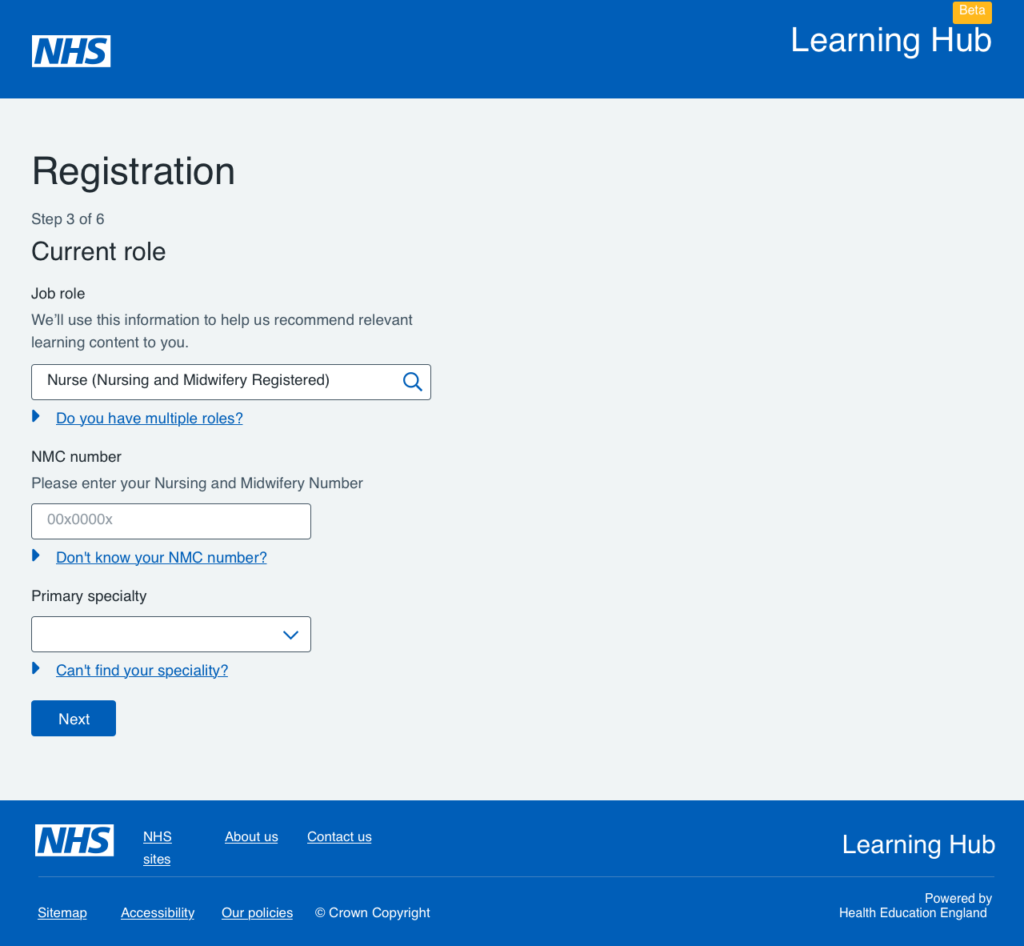
Final designs: A streamlined registration journey focused on clarity, accessibility, and supporting users with varying levels of digital confidence.
The Outcome
The redesigned registration journey was positively received in usability testing. Users found the new flow easier to follow, with clearer guidance and less anxiety around completing the form correctly.
The final designs and style guide were handed over to the development team for implementation, with the MVP focused on the three largest user groups and a clear path forward for expanding support to additional segments. The project set the foundation for a more inclusive and user-friendly onboarding experience across the UK healthcare and academic sectors.
Every team’s challenges are different. If you’re building something and want to explore how UX or design systems could support your growth, I’d love to hear more.