Improving Filter Performance and Usability at Carphone Warehouse
Making it Easier for Customers to Find the Right Mobile Deal
Carphone Warehouse’s filtering experience needed a significant upgrade to better support customers in narrowing down their choices. Before the redesign, users often struggled to apply and manage filters, especially on mobile where selected filters were hidden after application.
Through a combination of UX research, usability analysis, and design improvements, I helped lead a major update to the filtering system. The new design made filters easier to discover, apply, and manage, leading to higher engagement, stronger conversion rates across key filters, and a smoother product browsing experience for customers.
My Role
Conducting UX research, user testing, and solution design for the new filter experience.
Created and tested prototypes addressing visibility, efficiency, and performance issues.
Collaborated with stakeholders across UX, product, and development teams.
Reviewed ContentSquare data post-launch to assess the new UI’s performance and identify further optimisation opportunities.
Understanding the Problem
Before the redesign, we carried out a mix of user research and best-practice benchmarking to understand where the filter experience was falling short and how it could be improved:
Usability Testing
We observed users struggling to efficiently narrow down their choices due to limited filter options, disruptive page refreshes, and lack of flexibility when applying filters.
Card Sorting
Conducted card sorting activities to understand how users naturally prioritised different filters when shopping for mobile phones, helping inform the future filter order.
UX Review and Best Practices
Through an in-depth review of the existing filtering experience, alongside competitor benchmarking and Baymard Institute guidelines, I identified several critical usability gaps:
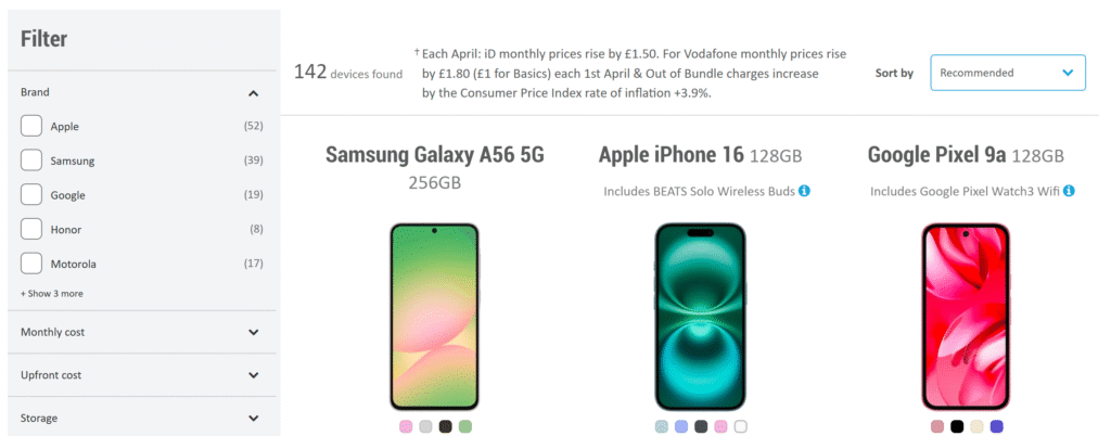
Lack of applied filter visibility: users couldn’t easily see or remove filters once applied.
Filters relied on logos instead of text labels, reducing clarity and accessibility, especially for less familiar brands.
No indication of the number of matches for each filter, leading to frustration when filters returned very few results.
Use of swatch-style selection tiles instead of standard checkboxes, making it harder for users to scan and apply multiple filters quickly and consistently.
Unclear or inconsistent filter labels, making it harder for users to understand their options at a glance.
Solution Design
The redesign focused on making filtering faster, clearer, and more intuitive:
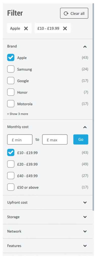
Applied filters overview: Introduced a persistent, pill-style summary of selected filters directly on the product listing page. This made it easy for users to review their selections at a glance and remove individual filters with a single click.
Clear text labels: Replaced brand and network logos with text labels for better readability and accessibility.
Checkboxes for selection: Switched from swatch-style tiles to standard checkboxes, making it quicker to scan and apply multiple filters.
Number of matches displayed: Added real-time product counts next to each filter option to help users filter more confidently.
Simplified filter labels: Renamed unclear filters to better match user expectations and improve scannability.
Filter reordering based on research: Reordered filters based on insights from card sorting and usage data, prioritising the most important options.
Outcomes
Conversion rates improved for 8 out of 10 filters after launch.
For example:Features filter: +2.38% conversion rate improvement
Free gift filter: +2.15% improvement
Upfront cost filter: +1.98% improvement
Engagement increased, especially for filters like Refurbished, SIM Type, and Features, which became more visible and attracted more clicks.
Post-launch ContentSquare analysis showed further opportunities for optimisation, such as:
Prioritising high-performing filters like Upfront cost higher in the list.
De-prioritising lower-performing filters like Colour.
Working on a digital product?
I help teams create experiences that are easy to use and aligned with their brand. Whether you’re starting from scratch or refining an existing product, I can support you through the process.
What to expect
Reach out by email
Tell me a little about your product or any challenge you’re facing. Nothing too detailed.
Book a free 20-minute intro call
We’ll chat through things in more depth so I can better understand your goals and where I can support.
I'll follow up with a suggested approach
After the call, I’ll take some time to reflect and put together a suggested plan based on what we discussed.
You’ll receive a detailed proposal
If you’d like to move forward, I’ll prepare a full proposal with scope, timeline, and pricing.